Designing Art Experience
Sep.2026
Read Article
↓
↓

A digital experience designed around art, access, and discovery.
Behind the new Cleveland Museum of Art website was a much larger question than how to redesign a set of pages. How could one digital experience support a museum before, during, and after a visit, while making its collection accessible to people who might never enter the building?
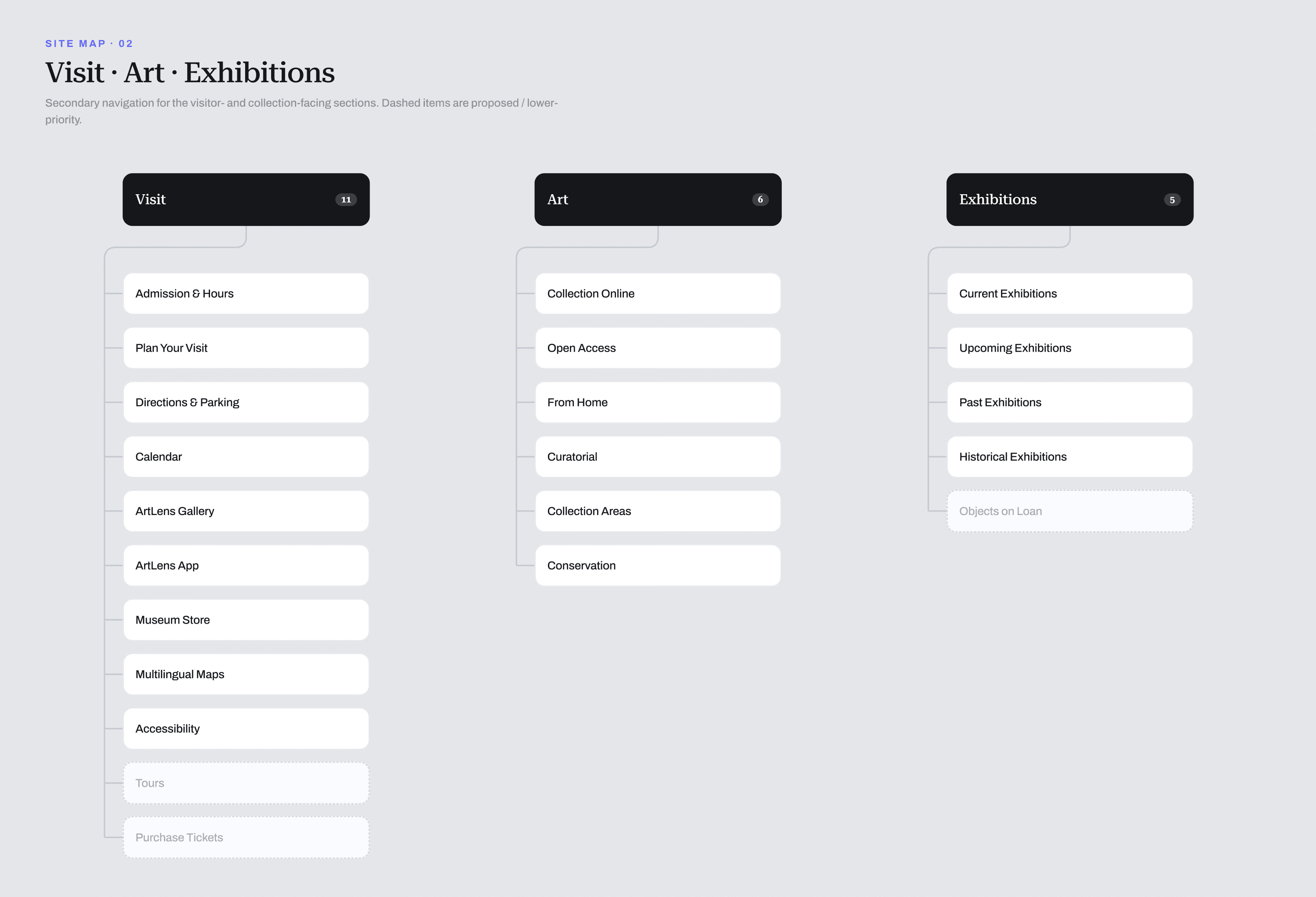
The challenge was to bring a fragmented ecosystem into one coherent platform without flattening its complexity. Ticketing, events, membership, editorial content, research, and thousands of artworks needed to feel connected, while continuing to serve very different needs.

Research: Understanding the museum ecosystem
Research began with a broader question: what does someone actually need from a museum online?
For some people, the website is a practical tool for finding opening hours, accessibility information, exhibitions, parking, and tickets. For others, it is a research archive, a classroom, a source of creative material, or a place to encounter art without ever visiting Cleveland.
Looking at the experience through these different intentions helped us understand where institutional complexity was becoming visible to the user. It also allowed us to move away from an experience shaped by departments and disconnected platforms, toward one organized around people, purpose, and context.
UX: From ticket to artwork, from Creative Commons to remix
Two journeys became particularly useful lenses for the experience.
The first began with the intention to visit. It moved from discovering an exhibition to understanding its relevance, selecting a date, securing a ticket, planning the visit, and eventually standing in front of an artwork.
The second journey began with the artwork itself. A person could discover an object, understand its context and usage rights, access its metadata, download a high-resolution image, and reuse or remix it through the museum’s Open Access program.
Designing for both journeys meant treating the website as the front door to the physical museum and as a museum experience in its own right. Open Access only becomes meaningful when people can understand what is available and act on that knowledge without friction.

Art Detail: The heart of the museum
At the center of both journeys was the art detail page. We treated it as more than a database record. It became the smallest complete expression of the museum.
The page needed to work at multiple depths. At first glance, the artwork should command the experience. From there, visitors could progressively access the artist, title, date, location, description, provenance, conservation material, usage rights, downloads, and related works.
The design challenge was one of hierarchy. How could we preserve the emotional encounter with an artwork while supporting the depth and precision expected by researchers and scholars? The answer was not to reduce the information, but to reveal it with intention. The finished experience can support as many as 36 metadata fields without making the artwork feel secondary.

The power of a design system and an accessible environment
With so many content types, data sources, and user journeys, consistency could not depend on designing every page individually. The design system became a shared language connecting the collection, exhibitions, events, editorial content, membership, and transactional experiences.
Components established more than visual consistency. They defined hierarchy, interaction patterns, responsive behavior, content relationships, and the states required to make each experience understandable and predictable.
Accessibility was built into that language through typography, contrast, labeling, navigation patterns, screen-reader support, and clear interaction states. Instead of treating accessibility as a final validation step, the system helped make inclusive decisions repeatable across the entire platform.

UI and art without losing intention
A museum interface needs a point of view, but it cannot compete with the collection.
Our visual approach gave the CMA a recognizable digital presence while allowing the interface to step back when the artwork entered the experience. Typography, scale, spacing, cropping, color, and motion were used to guide attention rather than claim it.
Consistency did not mean monotony. The same system could create different rhythms for an exhibition, an event, an editorial story, or an artwork record. Each experience could carry its own atmosphere while remaining part of the same museum.

Designing for the encounter
For me, this project reinforced an idea I keep returning to: the best digital experiences do not simplify complexity by removing it. They make complexity feel understandable, intentional, and human.
Designing for a museum meant knowing when the interface should guide, when it should explain, and when it should simply disappear. The website had to support tickets, research, accessibility, discovery, and thousands of objects, but ultimately all of those systems existed in service of something much simpler: creating a meaningful encounter between a person and a work of art.
That became the measure of the experience. Not how much design we could add, but how precisely design could create the conditions for curiosity, understanding, and discovery.

SHARE ARTICLE