Brand
/
Identity
/
Product Design
Porão do Rock
(
6
)

/ About the project
Created in Brasília in 1998, Porão do Rock is one of the most important independent rock festivals in Brazil and Latin America. Over the years, it has built a strong cultural legacy by bringing together major national and international acts while continuing to create space for independent and emerging artists.
The project focused on translating that history into a contemporary visual system capable of supporting a festival with many voices, artists and formats. Rather than creating a single key visual, I developed a flexible brand design system that could generate unique, minimal and visually strong compositions while keeping the festival instantly recognizable.
/ Credits
Client:
Porão do Rock
My Role:
Design Director / Brand Designer
Services:
Brand System, Visual Identity, Art Direction, Digital Design
/ Year
2024


/ PROBLEM
Porão do Rock carries more than two decades of cultural history, but its communication needs to constantly adapt to new lineups, artists, formats and audiences. The challenge was to create a visual language strong enough to express the festival’s personality while remaining flexible enough to avoid repetitive or overly templated communication.
/ SOLUTION
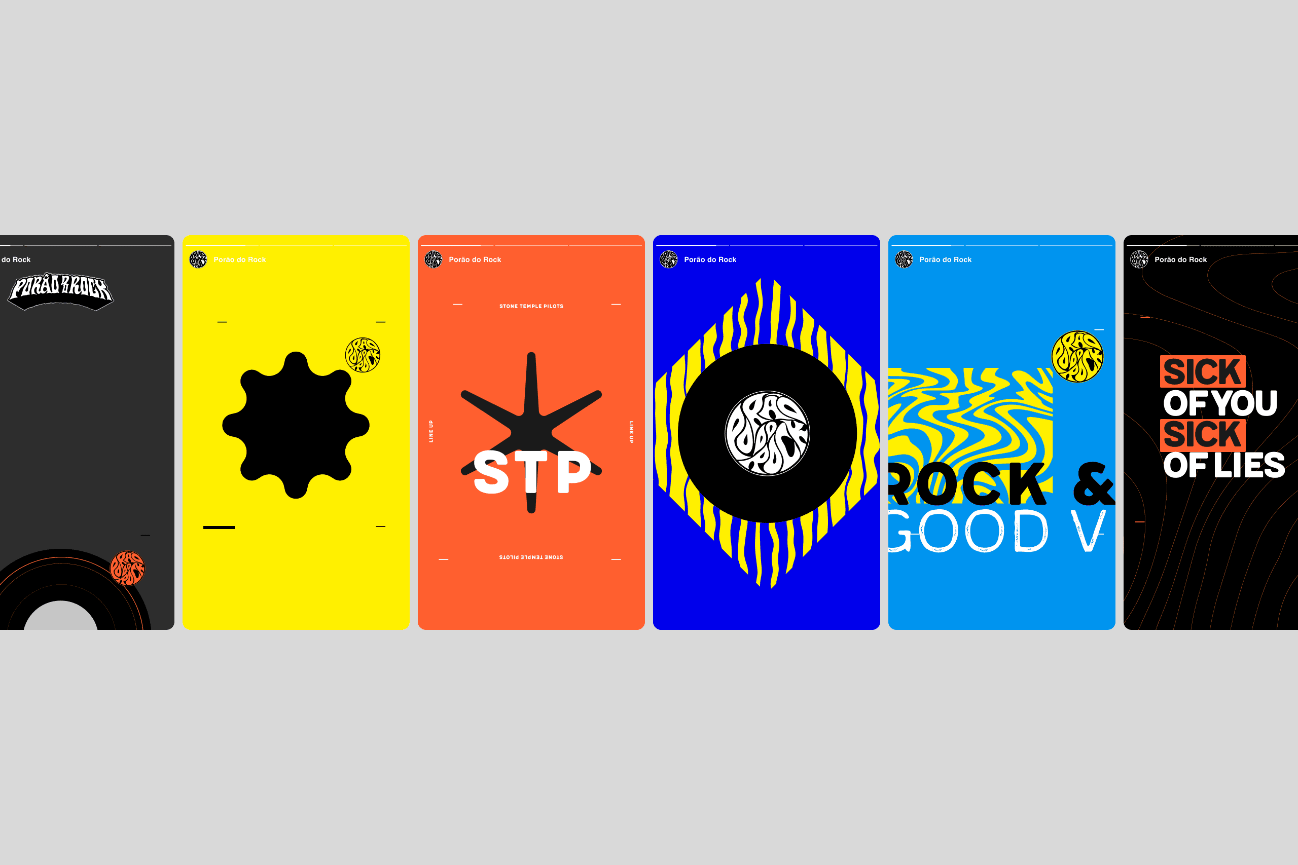
I created a modular visual system based on a reduced vocabulary of geometric forms, symbols, typography and color. These elements could be scaled, rotated, combined, repeated or used to frame photography, allowing every artist and communication piece to have its own visual identity while remaining part of the same system. The simplicity of the elements made the system easy to expand and highly expressive in execution.
/ RESULTS
The result was a scalable visual language capable of moving across digital, print, merchandise and environmental applications without depending on a single fixed composition. The system gave Porão do Rock the freedom to create highly distinctive materials for different artists and moments while maintaining a consistent and recognizable brand presence.


/ PROJECT OVERVIEW
The design process started with reduction. Instead of relying on traditional rock aesthetics or creating a complex hero graphic, I built the identity from a limited collection of simple forms. Circles, stars, organic shapes and graphic marks became a flexible visual vocabulary that could constantly be recombined.
This modular approach allowed the identity to shift naturally between minimal and expressive compositions. A single symbol could dominate a poster, become a frame for an artist image, evolve into a pattern or extend into a digital interface. The result was a system designed not to repeat itself, but to stay recognizable through a consistent set of visual rules.



OTHER
PROJECTS


Get in touch