Product Design
/
Graphic Design
/
Identity
Samsung Artik
(
9
)
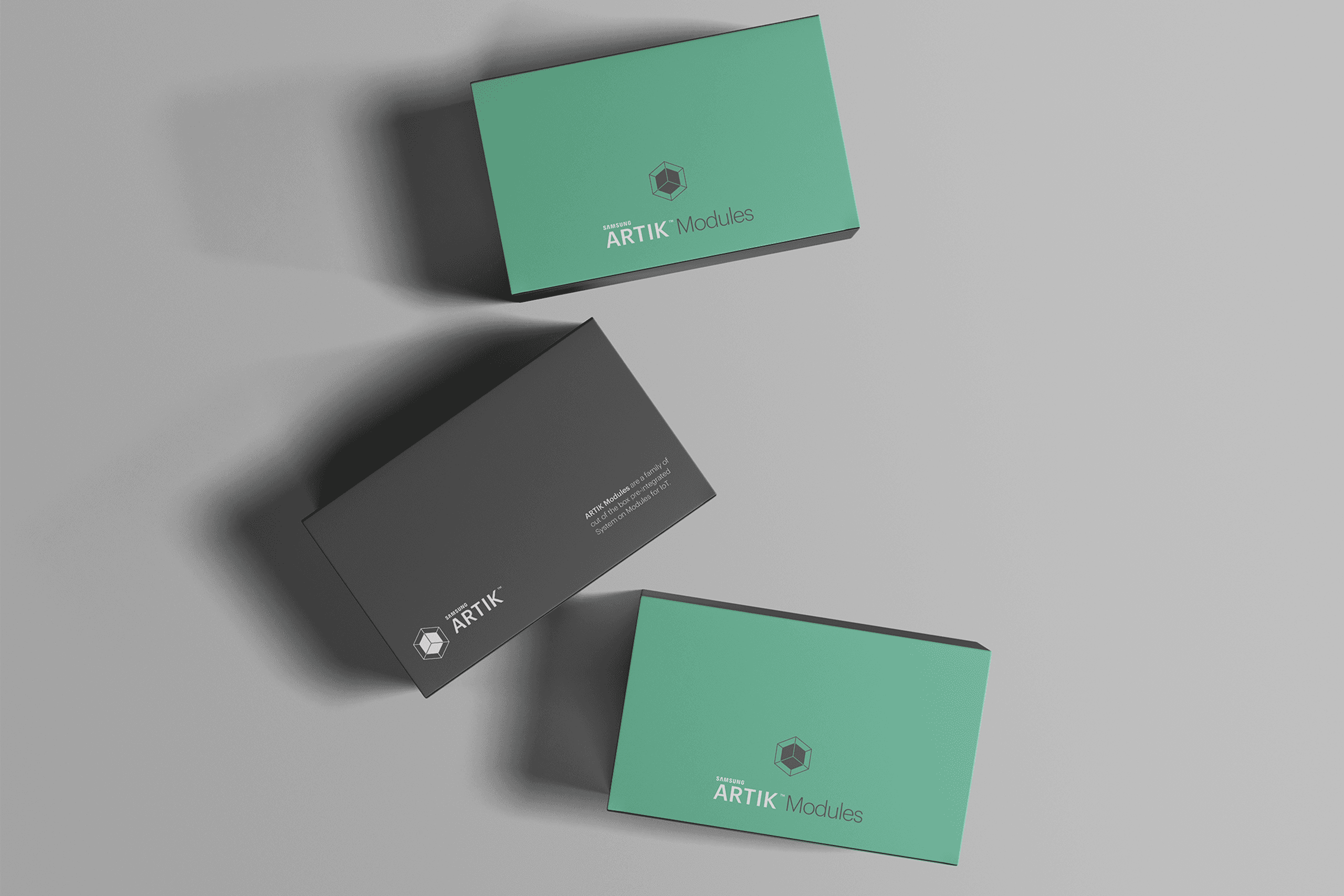
/ About the project
Samsung ARTIK was an open Internet of Things platform created to help developers and businesses move faster from connected-device ideas to real products. The ecosystem combined hardware modules, software, cloud connectivity, security and developer tools in a single platform designed for applications ranging from wearables and smart homes to industrial systems.
The design challenge was to make that complexity understandable. My work helped translate a highly technical product ecosystem into a clear and consistent visual experience across digital products, developer resources, technical documentation, packaging and communication.
/ Credits
Client:
Samsung
My Role:
Senior Design Consultant / Product Designer
Services:
Product Design, UX/UI, Visual Systems, Art Direction, Developer Experience
/ Year
2017
/ PROBLEM
ARTIK brought together multiple hardware families, cloud services, documentation and development tools, each serving different technical needs and audiences. The challenge was to create an experience that could communicate this complexity without overwhelming developers, while establishing enough consistency for the platform to feel like one connected ecosystem rather than a collection of individual products.
/ SOLUTION
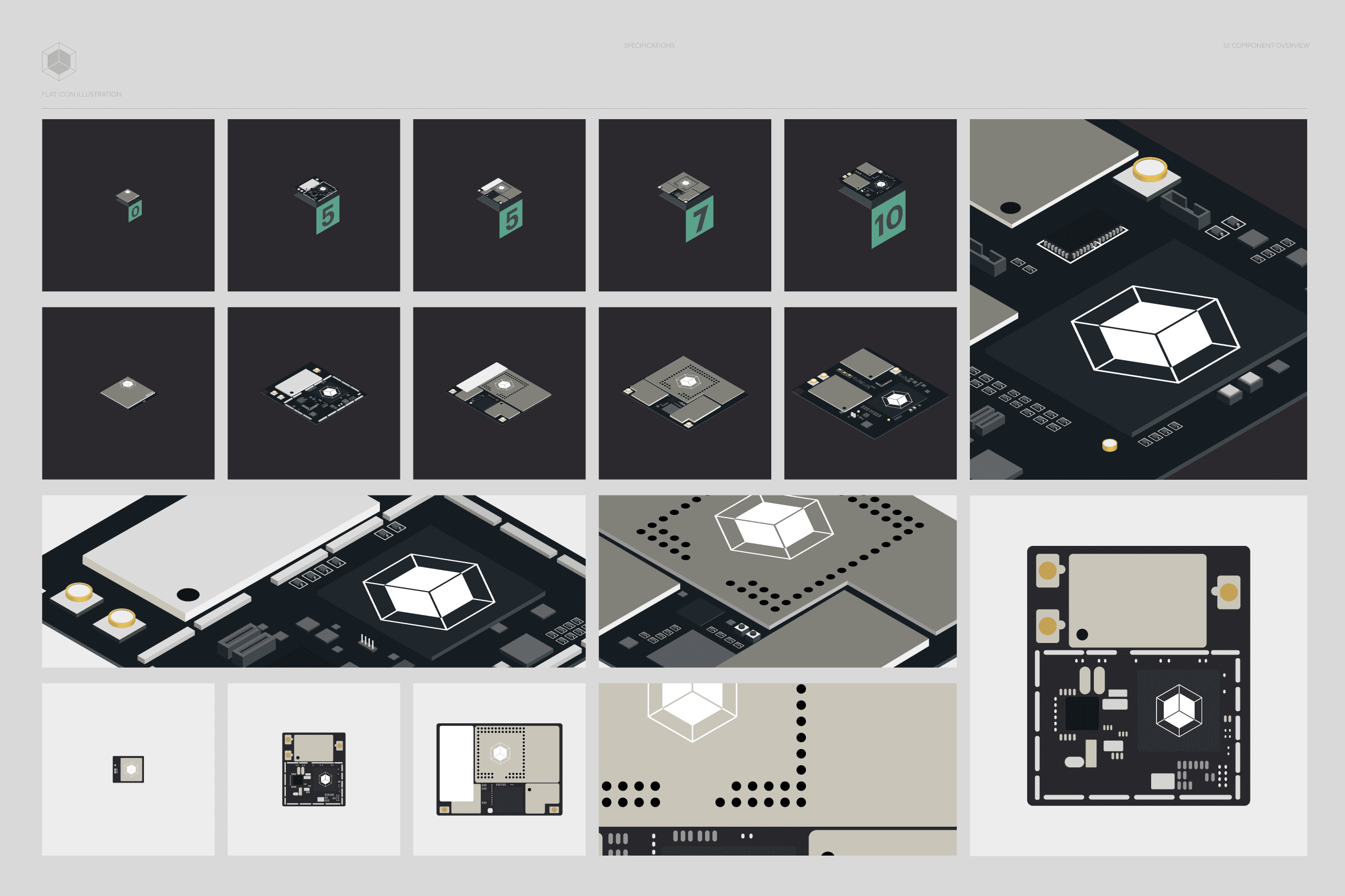
I developed a modular visual and digital system inspired by the architecture of the technology itself. Product modules were translated into simplified isometric illustrations and a structured visual language that could scale from technical specifications and developer documentation to websites, packaging and launch communication. Clear hierarchy, restrained typography and product-specific color coding helped make technical information easier to navigate while maintaining a distinctive Samsung ARTIK identity.
/ RESULTS
The system created a coherent experience across ARTIK’s growing product family and developer ecosystem. As Samsung expanded the platform with new module families, cloud capabilities and partnerships, the design framework could accommodate new products and information without requiring a new visual approach each time, supporting a platform built to help companies bring IoT products to market faster.


/ PROJECT OVERVIEW
The design approach started with the product itself. ARTIK was essentially a collection of building blocks, so the visual language followed the same principle. The physical modules became the foundation for a family of simplified illustrations and compositions that made differences in size, capability and product category visible without relying exclusively on dense technical information.
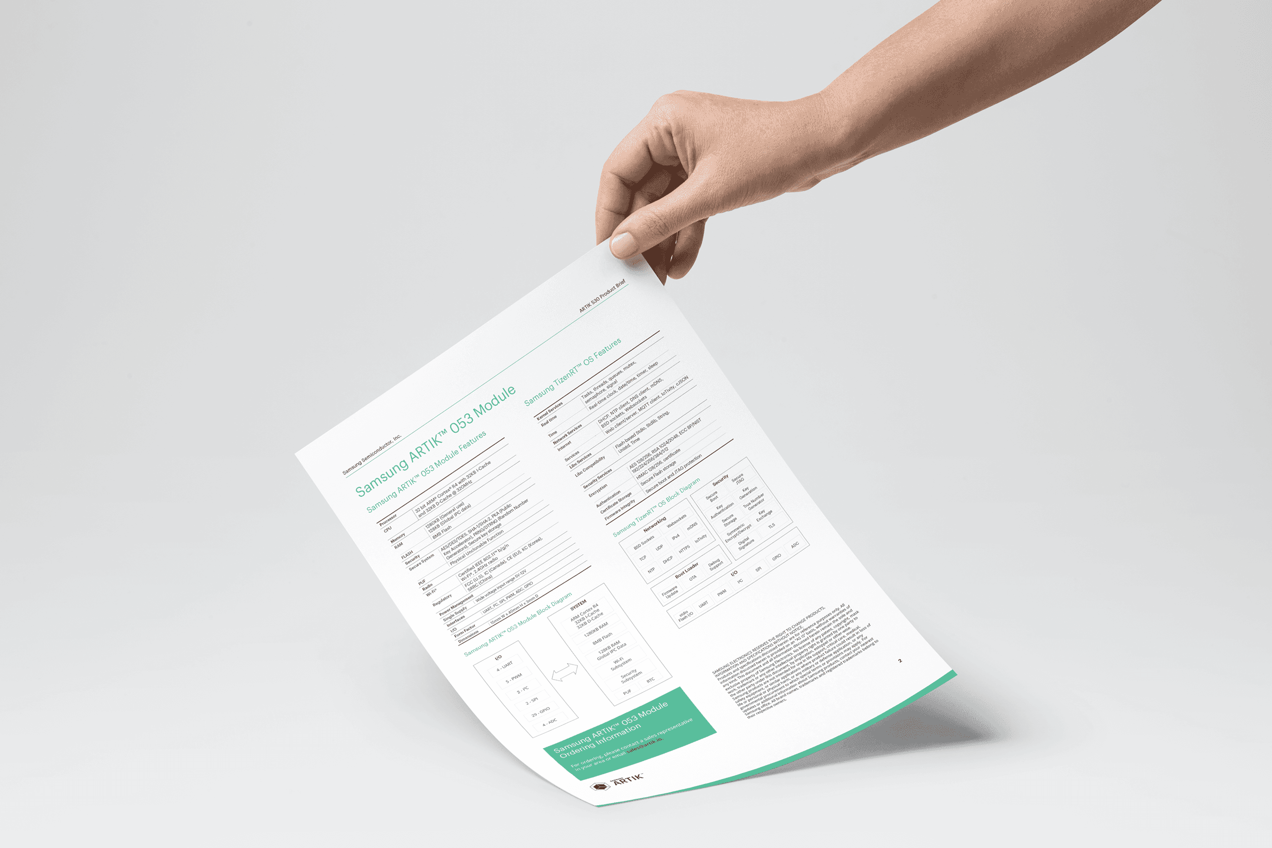
That language extended across the entire experience. Developer pages, technical documents, product packaging, diagrams, digital interfaces and communication materials shared the same underlying structure, allowing highly specialized information to feel approachable and connected. The result was a design system that did more than present the technology: it helped explain how the ARTIK ecosystem worked.


OTHER
PROJECTS


Get in touch