


A new face for an agency celebrating its 18th year in the digital market in Brasilia. A digital-born company that is constantly seeking to evolve its innovation DNA. The new brand is dynamic and young, and seeks to communicate boldly.

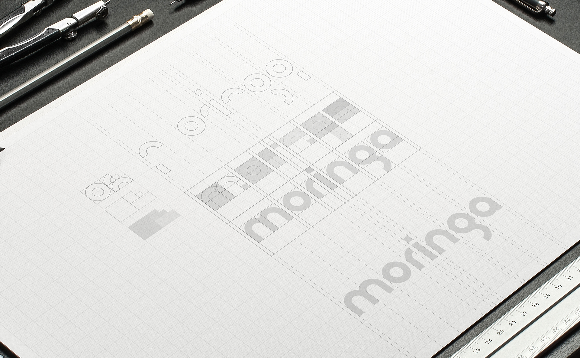
The first step of the project was to design the agency’s own geometric font that could be broken into several elements that form its visual identity. Inspired by the architecture and colors of Brasilia, the brand aims to show that Moringa is born in the capital city, but is ready for expansion.


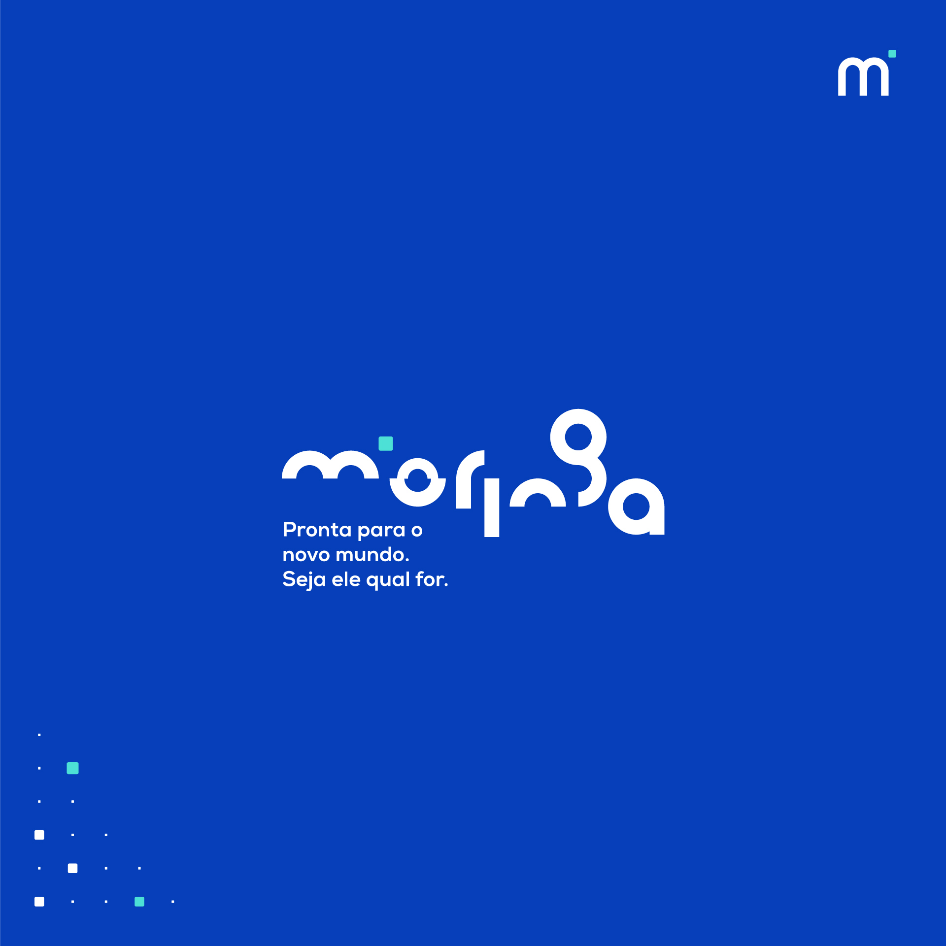


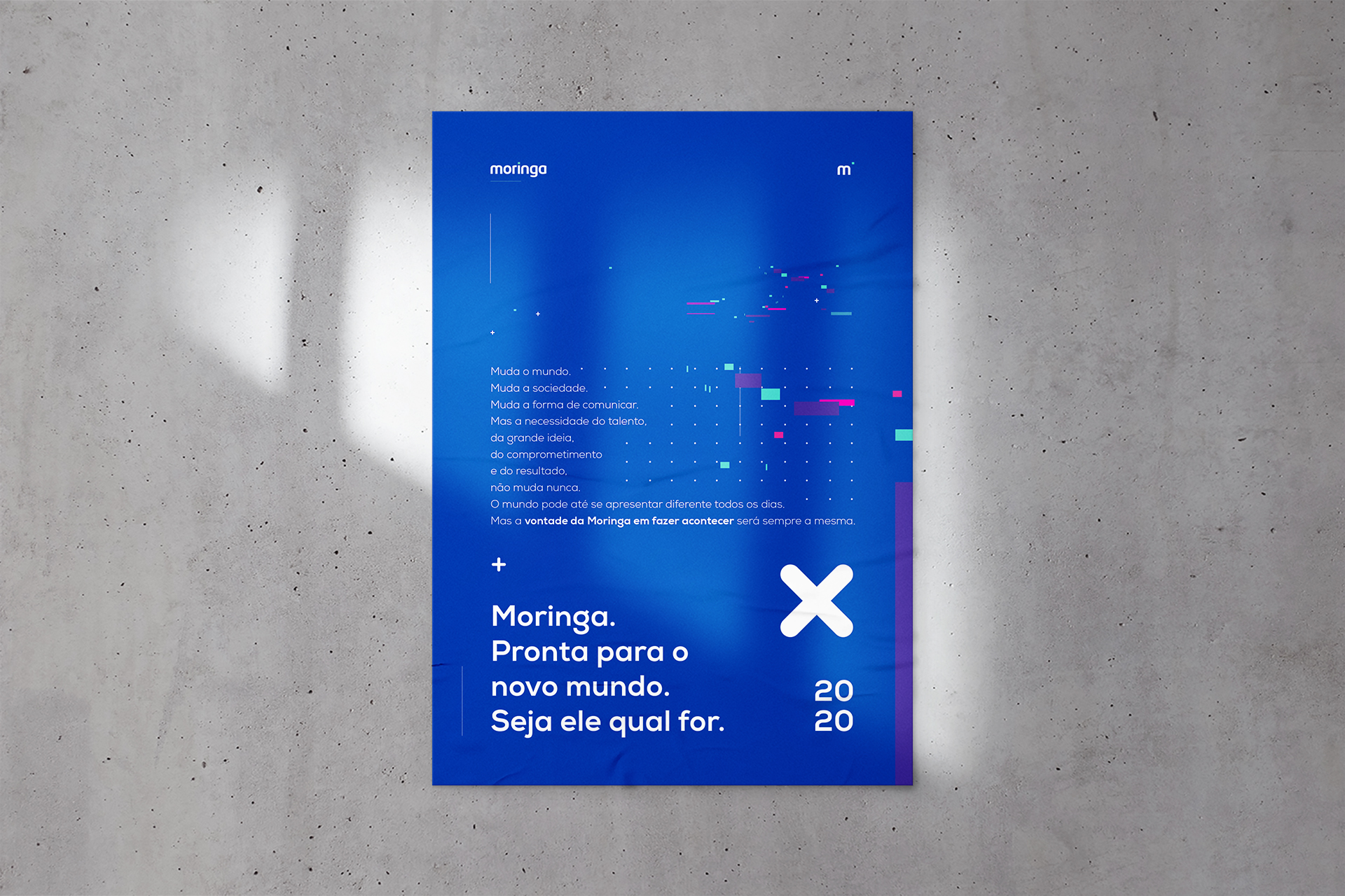
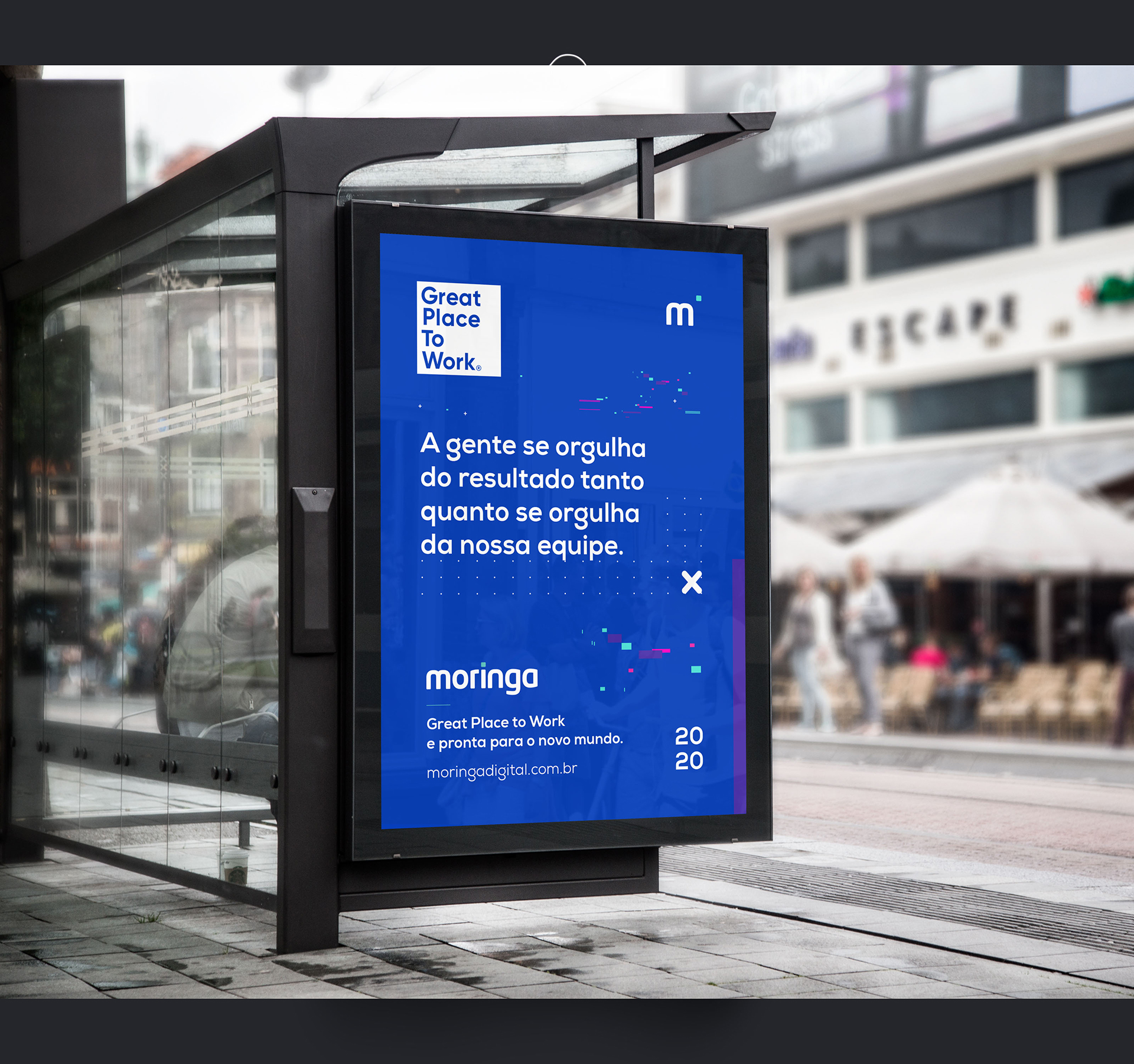

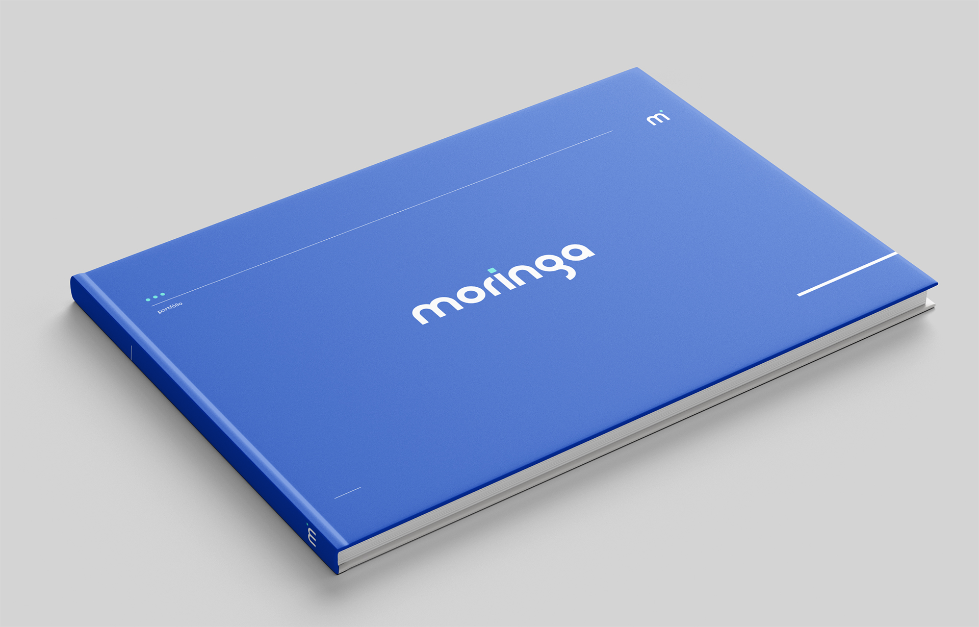

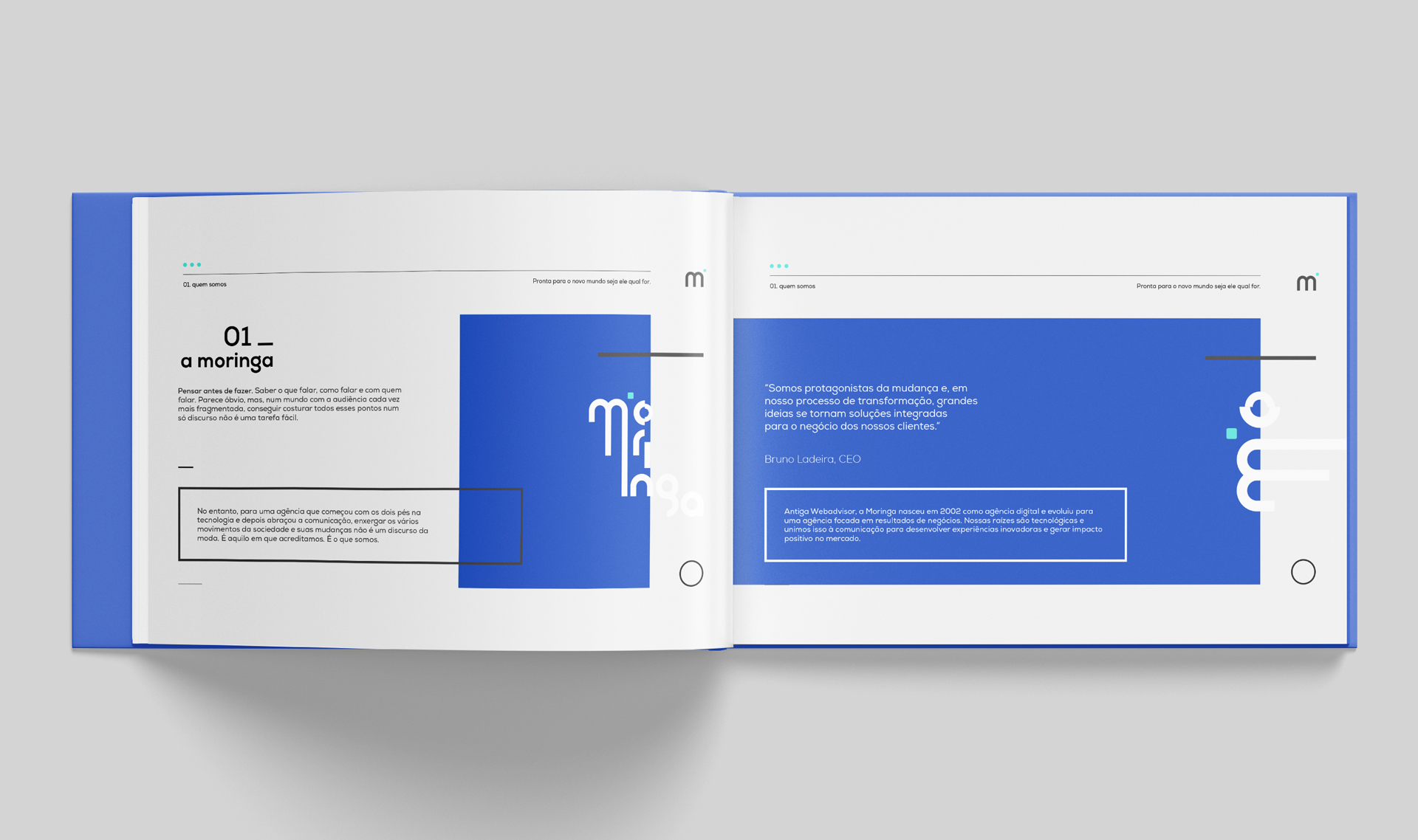

A brand designed in every detail to work as a visual puzzle. Vibrant colors and balanced geometric shapes to show personality and a youthful spirit.
